The Logo Design Process: 7 Steps Professional Designers Follow
A logo looks simple. That is the point. But behind a simple, memorable mark is a structured process of research, thinking, sketching, testing and refining. When business owners understand the logo design process, they write better briefs, give more useful feedback and end up with a logo that works for years instead of months.
This guide explains the seven steps professional designers follow, what you should provide at each stage, what files you should receive at the end and the mistakes that lead to expensive redesigns.
Why the Logo Design Process Matters
A logo is often the most repeated visual element of your brand. It appears on your website, social profiles, invoices, packaging, signage, uniforms, ads and app icons. A poorly planned logo creates problems everywhere: it may be unreadable on a phone, impossible to embroider, confusing next to competitors or simply out of step with what the business has become.
A good process protects you from these issues. It also makes the result defensible. When every design decision connects to your audience and positioning, the logo is not just “something the founder liked” but a strategic asset.
What Makes a Good Logo?
Before the steps, it helps to agree on what you are aiming for. Professional designers typically check logos against these qualities:
| Quality | What it means | Quick test |
| Simple | Few elements, easy to understand | Can someone sketch it from memory? |
| Distinctive | Not easily confused with competitors | Put it next to five competitor logos |
| Relevant | Fits the audience and category | Does it feel right for your customers? |
| Scalable | Works large and very small | View it at favicon size (16–32 px) |
| Versatile | Works in one colour and on dark/light backgrounds | Print it in black and white |
| Timeless | Not dependent on short-lived trends | Would it still work in ten years? |
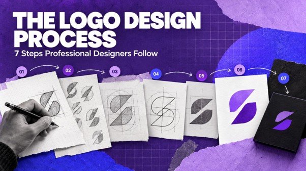
Step 1: Discovery and the Design Brief
Every good logo starts with understanding the business. In discovery, the designer or agency asks about:
• What the business does and for whom.
• The brand’s positioning, personality and values.
• Competitors and how you want to differ from them.
• Where the logo will be used most (digital, print, packaging, signage, merchandise).
• Practical constraints, such as name length, languages and existing assets.
• What you like and dislike, with reasons.
The output is a design brief. A strong brief includes the brand strategy summary, target audience, three to five personality words, must-haves, must-avoids and a list of applications. If your brand strategy is unclear, it is worth fixing that first. VisionaryCue’s brand strategy work often comes before identity design for this reason.
What You Should Provide
• A short description of your business and audience.
• Your positioning statement or key differentiator.
• Examples of brands you admire (inside and outside your industry) and why.
• Any existing logo or assets, with what you want to keep.
• Where and how the logo will be used.
Step 2: Research
Designers research the market so the logo can stand out for the right reasons. This includes:
• Competitor audit: collecting competitor logos to identify common colours, shapes and styles to avoid copying.
• Category conventions: understanding which visual cues help customers recognise your category, and which ones you can break.
• Audience research: checking what your customers find trustworthy or attractive.
• Name exploration: looking at the meaning, sound and letterforms of your brand name.
Research also includes a basic check that the concept direction is not too close to existing marks. For formal protection, consult a trademark attorney and search the official trademark registry before finalising. Our research service covers competitor and market research that informs design.
Step 3: Concept Development and Sketching
This is where ideas begin. Designers usually start on paper or a tablet, sketching dozens of rough ideas quickly. They explore different routes, such as:
• Wordmark: the brand name in distinctive type (good for unique, short names).
• Lettermark: initials or a monogram (good for long names).
• Pictorial mark: a recognisable symbol.
• Abstract mark: a unique shape that represents an idea.
• Combination mark: symbol plus wordmark (very common and flexible).
• Emblem: text inside a shape, such as a badge or seal.
The aim at this stage is quantity and variety. Most sketches will be discarded.
Choosing a Logo Type
| Logo type | Strengths | Watch out for |
| Wordmark | Builds name recognition directly | Needs a distinctive name and careful typography |
| Lettermark | Compact, good for long names | Initials alone can be forgettable early on |
| Pictorial mark | Memorable, works without text later | Can limit you if the business expands |
| Abstract mark | Unique and ownable | Needs investment to build meaning |
| Combination mark | Flexible across uses | Ensure each part works separately too |
| Emblem | Classic, works for heritage brands | Can become unreadable at small sizes |
Step 4: Digital Design of Shortlisted Concepts
The strongest sketches are developed digitally as vectors (usually in tools such as Adobe Illustrator or Figma). Professional designers first develop concepts in black and white. This ensures the shape works on its own before colour is added. Colour can hide weak structure.
Typically, an agency presents two to four distinct directions. Each direction should come with:
• The rationale: how it connects to your strategy.
• The logo in context: on a website header, business card, social profile and storefront or packaging.
• Small-size tests.
Seeing logos in context helps you judge them as customers will, not as isolated artwork.
Step 5: Feedback and Refinement
This is where your input matters most. Useful feedback focuses on goals, not personal taste.
Less useful: “I don’t like green.”
More useful: “This feels too playful for our hospital clients, who need to trust us with compliance.”
Tips for giving good logo feedback:
• Judge each concept against the brief, not against each other.
• Involve a small group of decision-makers, not the whole company.
• Look at concepts at different sizes and on mobile.
• Avoid asking friends to vote; they are not your target customers.
• Give feedback in writing, organised by concept.
Most projects include two or three rounds of refinement on the chosen direction. Refinements may adjust spacing, weight, letter shapes, proportions and the relationship between symbol and text.
Step 6: Colour, Typography and Variations
Once the shape is approved, the designer finalises:
• Colour palette: primary colours with HEX, RGB, CMYK and often Pantone values for print consistency.
• Typography: the logotype and recommended fonts for headings and body text.
• Variations: horizontal and stacked versions, icon-only mark, single-colour versions and reversed (white) versions.
• Clear space and minimum size rules: to keep the logo legible and uncluttered.
Colour choices should consider contrast and accessibility, especially for digital use. Light grey text on white, for example, may look elegant but can be hard to read.
Step 7: Final Files and Brand Guidelines
At the end, you should receive a complete file package. Here is a typical set:
| File type | Use |
| AI / EPS / PDF (vector) | Master files for print, signage and future edits |
| SVG | Websites and apps, scales without losing quality |
| PNG (transparent) | Social media, presentations, documents |
| JPG | Quick use where transparency is not needed |
| Favicon / app icon | Browser tabs and app stores |
| Social profile versions | Correctly cropped for platform circles and squares |
You should also receive basic logo usage guidelines covering clear space, minimum sizes, colour codes, approved variations and examples of incorrect use. Without guidelines, logos get stretched, recoloured and placed on busy backgrounds, which weakens recognition over time. Our post on why consistency beats talent in brand building explains why this matters.
Finally, confirm in writing that you own the rights to the final logo and that any fonts used are licensed for commercial use.
How Long Does the Logo Design Process Take?
Timelines vary with scope and feedback speed. As a general guide:
• Simple logo for a small business: around two to four weeks.
• Logo with full identity system and guidelines: around four to eight weeks.
• Rebrand for an established company with stakeholder reviews: often two to four months.
The biggest factor is usually decision-making time on the client side. Agreeing on who approves the logo before starting can save weeks.
Practical Example: An Illustrative Logo Project
Consider an illustrative organic tea brand launching online. Discovery reveals the audience is health-conscious urban buyers who value purity and calm. Competitor research shows most tea brands use heavy ornamental emblems in red and gold.
The designer explores a minimal combination mark with a single leaf shape formed from a drop of water, in a soft green and off-white palette. In context tests, it stands out clearly on a crowded e-commerce listing and remains legible as a tiny app icon. After two refinement rounds, the client receives vector files, social versions, a favicon and a two-page usage guide.
For a real example of this kind of work, see how VisionaryCue created a distinctive visual mark for Naturin.
Common Logo Design Mistakes to Avoid
1. Skipping strategy. Designing before you know your audience and positioning leads to taste-based decisions.
2. Following trends too closely. Trend-driven logos date quickly.
3. Too much detail. Fine lines and gradients disappear at small sizes.
4. Relying on colour. If the logo does not work in black and white, it is not ready.
5. Design by committee. Too many opinions produce compromise designs.
6. Ignoring legal checks. A logo too similar to an existing mark can cause disputes.
7. Not getting the right files. Without vector masters, every future use becomes harder.
Many of these overlap with wider branding mistakes that cost clients.
Conclusion
The logo design process is not about waiting for a moment of inspiration. It is a structured journey from understanding your business to delivering a flexible, well-documented mark. Discovery and research make the logo relevant. Sketching and digital development make it distinctive. Feedback and refinement make it right. Variations, files and guidelines make it usable for years.
If you treat your logo as a strategic asset rather than a quick graphic, it will repay you in recognition every day.
Planning a new logo or identity? VisionaryCue’s brand identity and logo design service connects research and strategy to production-ready design. Talk to our team about your project.
Frequently Asked Questions
What are the main steps in the logo design process?
The main steps are discovery and briefing, research, concept sketching, digital development of shortlisted concepts, feedback and refinement, finalising colour, typography and variations, and delivering final files with usage guidelines. Each step builds on the previous one, so the final logo connects clearly to your brand strategy.
How long does it take to design a professional logo?
A simple logo usually takes two to four weeks. A logo with a complete identity system and guidelines often takes four to eight weeks, while a rebrand for an established company can take several months. Fast, clear feedback and a single decision-maker help keep projects on schedule.
What should I include in a logo design brief?
Include what your business does, your target audience, positioning, three to five personality words, competitors, brands you admire and why, where the logo will be used, any must-haves or must-avoids, existing assets, budget and timeline. A clear brief reduces revision rounds and leads to better concepts.
How many logo concepts should a designer show?
Most professional designers present two to four distinct, well-developed directions rather than many rough options. Fewer, stronger concepts with clear rationale make decisions easier. Showing too many options can confuse stakeholders and often signals that the designer has not filtered ideas against the brief.
Which logo file formats do I need?
You should receive vector master files (AI, EPS or PDF), SVG for web use, transparent PNGs for digital use, JPGs, a favicon or app icon and social media profile versions. Ask for full-colour, single-colour and reversed versions, plus colour codes in HEX, RGB and CMYK.
Why do designers start logos in black and white?
Starting in black and white ensures the shape, structure and readability work without relying on colour. A logo must work in single-colour situations such as stamps, embroidery, newspaper ads and fax-style documents. Colour is added once the form is strong, which makes the final logo more versatile.
Should a small business choose a wordmark or a symbol?
If your name is short and distinctive, a wordmark builds name recognition efficiently. If your name is long or you need a compact icon for apps and social profiles, a combination mark with a simple symbol is usually more flexible. The choice should follow your positioning and where the logo appears most.
How much does logo design cost in India?
Costs range widely. Template or marketplace logos are cheapest but rarely original. Freelancers charge more, and agencies cost more again because they include research, strategy, multiple concepts, refinement and guidelines. Compare proposals by deliverables, rounds of revisions and file formats, not just price.
Do I own the copyright to my logo?
Ownership depends on your contract. Make sure the agreement transfers full rights of the final approved logo to your business on payment, and confirm that fonts and any stock elements are licensed for commercial use. For trademark protection, consult a qualified trademark attorney and register the mark.
How do I know if my logo needs a redesign?
Consider a redesign if your logo is hard to read at small sizes, looks dated, is too similar to competitors, no longer fits your audience or services, or has been applied inconsistently for years. Sometimes a refresh of proportions, colours and files solves the problem without losing existing recognition.